Friday, 26 June 2009
Friday, 8 May 2009
Evaluation
1.In what ways does your media product use, develop or challenge forms and conventions of real media products?
My media product challenges forms and conventions of real media products as it is a multi-genre music magazine. I have done this with the front cover as the masthead font and name connotes that it is a hard-rock magazine or an alternative rock magazine, however, the main image challenges that as it is a medium close up of a hip-hop DnB artist. However, in a popular magazine like Kerrang, the images an mastheads used helpc onnote that it is a rock magazine. Under my mast-head, it says “The worlds most unique niche music magazine.” It is also challenged as also other pictures on the front cover are of different genres, one is of a heavy metal band, with the name ‘Curbstomp’ another is an alternative pop punk band called ‘What Just Happened’. (Note, this isn’t the final piece)

2. How does your media product represent particular social groups?
My media product represents a variety of social groups, ranging from a rock ran to a hip-hop fan so it is very hard to talk about how the magazine represents a particular social group when it represents a broad variety. How it does this is when it wants to attract a particular social group for that part of the magazine I have used very stereotypical views of that social group and genre. For the hip-hop RnB fans, I have made sure the artist is looking flash and very modern, this helps reinforce the ‘perfect partner’ ideal. For the rock fan I have made the rock artists very stereotypical with long hair and baggy clothes, pulling angry faces and having powerful, sometimes angry band names. Each representation of a different social group is portrayed by a strong stereotype, helping reinforce self identity and embody strong emotional responses.
3. What kind of media institution might distribute your media product and why?
My magazine would most likely attract a small independent company. This is because though my magazine attracts a wide variety of social groups, it does not focus on just one and so would only attract readers who are into different genres of music. The circulation would be small and at first promoted to the public through the radio and local websites. It would also have its own website for readers to browse through and subscribe online, there would also be an option to buy online as the circulation is small it may run out of print if it became popular.
4. Who would be the audience for your media product?
My audience would be, like I have stated previously, a vast wide selection of social groups. They would be aged 16-24 and range from both genders, I would not however attract audiences for such genres as country, or classical music as my media product does not contain them. From my feedback I have received I have received from 3 different people who I know all enjoy different tastes of music. From the type of music my magazine contains, my readership will most likely be those that spend quite a lot of money on items, be it clothes, audio devices or footwear. This is helped because on the magazine, there will be images that provide the perfect partner image, so my audience will want to dress like them and act like them.
5. How did you attract/address your audience?
My magazine attracted my audience in a number of ways, the front cover itself is very eye catching, using bright contrasting colours against each other. On the front cover is also a large image of a solo-artist, which makes people want to read about him and be him.
The mode of address in my magazine is peer-to-peer, relating to the reader on a personal level, this helps build a relationship with the reader and make him/her think that it is written for the reader. I have done this by writing as if I am writing to a friend or colleague, being very informal and using some abbreviations and slang.
On my second splash page, at the end I mention about ‘running around the peace gardens, was actually quite fun.’ This is peer-to-peer because it is like informing a friend of what I did then, and it is very informal.
 6. What have you learnt about technologies from the process of constructing this product? Make a list of what you have learned about technologies during your practical work. Web 2.0 (blogs), Photoshop (talk about which tools you have used, what you have learned about the software – strengths/weaknesses), Quark Xpress (talk about which tools you have used, what you have learned about the software – strengths/weaknesses). This can be done in bullet points with images uploaded alongside.
I have learnt a many number of things whilst constructing my media product, the main one being learning how to use Quark Xpress. Quark is a very useful tool in which I used to do my dekstop publishing, however, it does have some faults:
For a new starter, it is very difficult and complicated, as there are a lot of tools for very specific things.
Once you have got the basics of Quark it is hard to use it to its full potential as there are so many tools you are still getting used to it..
You cannot save Quark files as picture files, so you have to export them and convert them, which majority of the time, makes Quark crash or the files gets wiped. Very volatile.
However, the good points of Quark are:
Once grasped the controls allow for almost anything.
Create a professional media product with ease compared to other desktop publishing programs.
Can import pictures into Quark to edit and use.
I also used Photoshop which allowed me to edit my photos, crop them and resize them to how I wanted, it is a very good program as you can manipulate images anyway you want, if, you have the knowledge.
There are some bad things about Photoshop however:
Like Quark, for a new starter it is very difficult and complicated, as the tools there require knowledge of actual photo properties and the editing process.
It can be very complicated as some procedures require a lot of ‘left click, right click, tools, left click, select an option, right click’ etc. etc. However, on a whole Photoshop is a very good program:
Once grasped you can do what you want with images with ease.
Excels other photo editing programs.
Can do anything you want with the image
An in-depth help system, providing amazing amounts of help.
Thursday, 7 May 2009
Practise Photos.
Here are some practise photos for my magazine:


Tuesday, 21 April 2009

Interview
It is about his new and upcoming work
Tuesday, 31 March 2009
Treatment

Treatment
Production team:
Greg Colbeck
Synopsis:
A magazine about a wide variety of niche music. The magazine will contain a variety of genres; Alternative, Metal, Rock, Trance, D&B, Electro etc. etc.
Detail of Target Audience:
Unisex, 16-24. It will attract a large audience from many niche genres.
Photography Design:
I will photograph various friends as well as advertising the need for bands. I have already taken pictures of a band; I will be taking some around Sheffield and some at various parties and clubs. The front cover will be a medium close up of some of my friends, ‘performing’ as a trio, it will be a rock/alternative band and so will be in a non-uniformed pose, either each pulling a different facial expression, doing different poses or providing different gestures. They will be dressing up in bright colours that contrast with provide a stark contrast with each other; it will consist of two males and a female called Aaron, Leandra and Kristian.
Interview/Article:
I will interview my friend’s band about their recent tour. I will also interview a “solo artist” (Name - Jordan Carter) about his upcoming new album, containing a variety of Dubstep, electronic, D&B etc. etc. I will research into a few magazines, one which is an online Dubstep magazine called GetDarker.com
Initial Recce:
When using lights I will have a fire extinguisher with me just in case it sets alight, when required to get to a certain height to take a picture, I will have people around assisting in balancing me and making sure I do not fall. I will make sure all instruments used in photo shoots will be properly stored and kept, ensuring that they will not break. I will also make sure any cables are not in the way to provide a tripping hazard.
Tuesday, 17 March 2009

Generic Elements of a Music Magazine.
- Pictures
- List of Magazine Personnel
- Columns
- Text
- Page Numbers
- Title - "Contents"
- Editorial - Highlights Round Up
- Subscription Details
- Juxtopositioning
- Sub-Headings
Friday, 13 March 2009
5 Rules for taking a good cover photograph.
- No cluttered Backgrounds.
- Make sure you focus on the lead singer if it is a band.
If it is a solo artist make sure it is a medium shot - close up. - Leave room for a masthead. (~Don't cut off heads!~)
- No high angle shots, makes bad images as it connotes weakness and inferiority.
- Animate your band, make sure they look at the camera.
Wednesday, 11 March 2009
Appendix 5. Magazine Ideas.
Appendix 5
Idea 1.
Target audience
- Mainstream
- 55+
- Mixed gender
Sub-Genre
Classical and Opera
Title:
Classical Weekly. The title is simple and sensible as it is targeted towards an older audience. It connotes simplicity.
Ideas for main cover:
Very simple formal layout, a different instrument and musician on the front cover each week. Warm, neutral colours.
Ideas for splash article:
Review of the opera world tour.
Idea for possible other contents:
Up coming championships, interviews, tips and tricks.
Idea 2.
Target Audience:
- Niche
- 16-24
- Mixed Gender
Sub-Genre:
Wide Variety of non-mainstream music; D&B, Altern, Screamo, Trance-Metal, Industrial Metal etc. etc.
Title:
This IS Plan B – Connotes that ‘Plan A’ is all the mainstream music and so now its Plan B. Reinforcing the fact that all the Alternative music featured is directed at a Niche’ audience as ‘Plan B’ is second choice.
Ideas for main cover:
Messy, slightly incoherent, featured band dominating cover, few small pictures lower left and right of the cover. Bright contrasting colours.
Ideas for splash article:
A new cross-genre band interviewed. (name will come later).
Idea for possible other contents:
Tips on how to play certain instruments better.
‘Plan B In Action!’ tour details, pictures, interviews and an overview.
Idea 3.
Target Audience:
- Mainstream
- 16-24
- Mixed Gender
Sub-Genre:
Rap, RnB etc. etc.
Title:
Vuumm. This resembles the sound of a deep baseline. Much like Kerrang! Resembling the sound of an opening of a power chorde.
Ideas for main cover:
Straight and organised. Straight boxes and the same layout every issue. Gold black and white.
Ideas for splash article:
Interview about a Rapper’s childhood.
Ideas for possible other contents:
How to be inspired/Great sources of inspiration
The weekly charts
Advice from a rapper.
Friday, 6 March 2009
Mainstream and Niche
(High circulation and high readership figure.)
Niche is a media product targeted at a specific group of people.
(Small circulation and Small readership)
Mainstream magazine: Kerrang!
Niche magazine: Classic FM magazine.
Tuesday, 3 March 2009
What I learnt last week.
Last week, I managed to finish my contents page.
Tuesday, 24 February 2009

Friday, 23 January 2009
Front Cover: AO2 - AO4

I am required to investigate similar Media products as part of my initial planning.
Analysis of the Front cover:
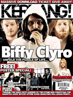
-Target Audience: The target audience of this magazine is male teenagers and young adults.
- Masthead and Sell Line: The Masthead "Kerrang!" connotes the opening of a power chord on a guitar, which is appropriate for a metal magazine. The Masthead has been designed to look as if it cracked, with the words "life is loud" printed across it, connoting that the contents of the magazine are very loud, yet again appropriate for a heavy metal magazine, the font is bold and in full capitals, yet again connoting that it contains loud music magazine, this is emphasised furthermore by the usage of colours black and white to create a striking Masthead yet again emphasising the contents of the magazine.
- Main cover image: The main cover image is of Matthew Bellamy from MUSE playing a guitar, the angle of the shot is a low angle shot, connoting power and authority, this is used to create the image of an ideal self and/or ideal partner as he is being portrayed as a "rock god". Matthew’s face is concentrating, showing that at that moment the image was taken he is playing very well.
- Main cover line for splash article: The main cover line for the splash article’s mode of address is peer-to-peer, it is coming across very informal, and in a "friendly" style as if it directed at the reader him/herself. The font is bold and in capital’s which has been put over a faint grey strip, giving it more of a striking presence, this contrasts with the rest of the cover, which is mainly composed of bright red and yellow, this connotes that the feature splash page is important and must be read.
- Cover lines: The words chosen for the cover lines are short, and to the point, usually consisting of just the band names. All the font is bold and black in full capitals, connoting furthermore that Kerrang! Is a "loud" magazine, at the top the band’s that are featured are separated by stars to help differentiate which band is which.. A single quote is used "We’re going to crush the UK!" This is the only quote on the cover, emphasising the context of the quote, yet again this connotes power and energy of the magazine.
- Other images: The other images are of various bands playing live, this ties in with the main feature of this edition of Kerrang! Which is the "100 greatest gigs ever". These are used as a ‘sneak-peak’ into who are in the list, each one is a close up of the singers face, which show many different emotions, this helps connote the genre of music that each band plays, for example, Bullet for my Valentine play heavy metal as the picture is of a band member’s face sticking his tongue out. Each of these images create an image of the ideal self and/or partner, as the pictuers are taken from a low angle, connoting power and authority.
Contents Page: AO2 - AO4

Analysis of the contents page:
- Juxtaposition of elements: The layout of the page is very organised, which is quite surprising as the magazine is a heavy metal magazine. This is to help the readers navigate the page and magazine better. The pictures are displayed above the featured pages to help show what the article is about.
Wednesday, 21 January 2009
Splash Page AO2 - AO4


Analysis of the splash page:
- Content:
The mode of address here is fluctuating, the content of the interview is peer-to-peer, talking like he is mates with the interviewer, which is directed at you, however, the interview is designed to inform, thus being teacher-to-pupil. The image is of a live show, the pose of the singer and the crowd cheering add to the effect that this is a rock concert and so enforces the fact that it is a rock magazine. The main predominant colours are various shades of yellow, black and white, creating a striking contrast and unison.
- Juxtaposition of elements: The main image is taking up majority of the left page, it is the main singer. This connotes power and authority as he gets an entire page to himself. The singer is also ‘pointing’ at the text, which he is in, it also represents him talking in the interview, and makes you read the interview as he is pointing at it. The text is positioned just above the crowd, so they are visible. All the writing is focused on a single page so there is two "separate" pages to the splash.